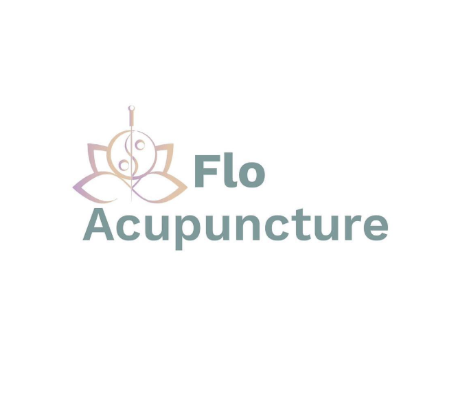
Flo Acupuncture
Brand refresh · Print & social media
Context
Commissioned to redesign an inaccessible existing logo into a brand that supports the business’s goals, future growth, and — most importantly — a diverse client base.
The project included branding, business cards, and social media templates.
Accessibility & Design Approach
Simplified the logo to improve clarity and legibility
Designed with accessibility in mind for a wide range of clients
Calm, balanced visual language aligned with wellbeing services
Brand system designed to work consistently across print and digital
Outcome
A professional, accessible brand identity that feels calm, trustworthy, and future-ready, supporting client confidence across physical and digital touchpoints.
Why This Matters
By replacing an inaccessible logo with a clear, legible, and inclusive identity, the rebrand demonstrates how accessibility-led graphic design directly supports wellbeing and client trust.
Client Feedback
“The level of consultation at every stage was outstanding. I am over the moon with my new brand redesign and the amount of support Harrison has provided. I would highly recommend him to anyone looking to refresh or create a brand from scratch.”